Chart Optimization Tips
Okay, enough vague intro-words, let's get concrete now. In the following example I'll be creating a regular column chart.
- 1
X-axis: show all labels
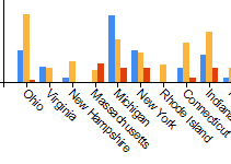
By default, a chart in SSRS will automatically position the labels on the X-axis as it best fits. However, one of these options includes hiding labels when the chart feels there are too many to show. As you can guess, this is not always what we want.
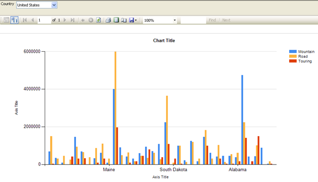
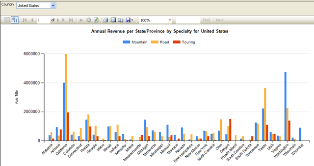
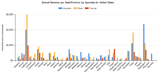
Have a look at the chart above and try to guess what you're seeing. Difficult, huh? Let's make some changes to it.
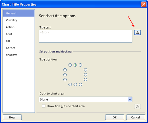
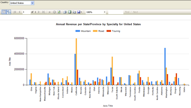
First we start with some basics like giving it a clear title. This chart shows the annual revenue per state/province, split up by store specialty. The states or provinces shown are those of the selected country. I would call it "Annual Revenue per State/Province by Specialty for <SELECTED_COUNTRY>". As you probably know, the chart's title can be edited by giving it a single-click. However, this does not give you the option to build an expression so unless you want to type it all from memory, here's another option. You can right-click on the chart's title. This gives you a pop-up menu with Title Properties... as one of the options.
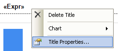
Selecting that one will give you the Chart Title Properties where you have the familiar Expression Builder icon next to Title Text textbox.
This is my expression:
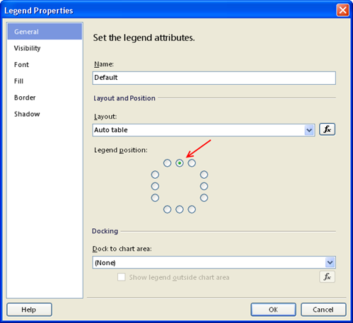
Also, let's move the legend to the upper middle to make extra horizontal space for all those bars. This can be done through the Legend Properties.
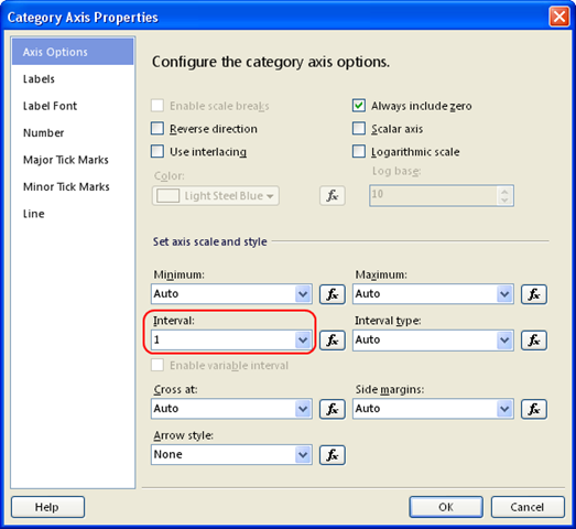
Lastly, now that we've freed up some space for the chart area, we'll modify the X-axis properties so that it shows all labels.
When opening up the axis properties for the X-axis on a column chart you get the Category Axis Properties screen. Like all other property screens, this is also one with several pages. You see that one of the pages is called Labels and as you want it to show all labels, that's were you start looking. Well, stop looking, that's the wrong place. The option that you need is located in the first page, the Axis Options, and its called Interval. This is the interval between each label on the axis, and by default it is set to Auto. As we want all labels, change it to 1.
Following screenshot shows what the result looks like:
Better, but we're not quite there yet.
- 2
X-axis: rotate labels in all directions
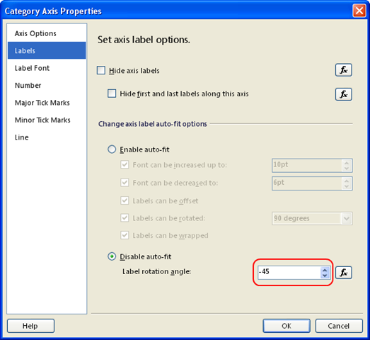
Right now the labels on the X-axis are difficult to read unless we turn our screen 90 degrees clockwise. Let's dive again into the Category Axis Properties to put them diagonally. On the Labels page there's an option to specify the Label Rotation Angle. To be able to do this you need to activate the Disable auto-fit radio button. Putting 45 as value will give the following:
The labels are rotated 45 degrees. But not in the direction that I would prefer. It's nicer when they're positioned from bottom-left to top-right. So you start increasing the rotation value. However, once you're past 90 you notice that the labels stay vertically, so 135 degrees does not put them in the direction as you'd hoped. The answer is quite simple, once you know it. As we want the opposite of our 45 degrees, and it's not 135, try -45 :-)
Indeed, that gives the following result (I've also removed the X-axis title).
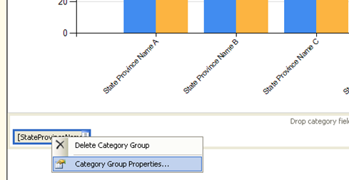
To finalize the X-axis optimization, I've added sorting so that the States/Provinces are sorted alphabetically. This is a recommended design practice to keep your different charts consistent.
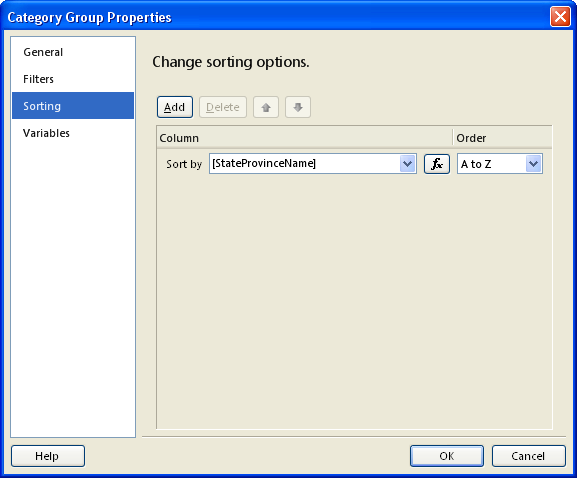
To get the labels sorted, you should not look into the Axis properties but in the Category Group Properties:
On the Sorting page just add the field that's shown on the X-axis.
- 3
Y-axis: make numbers readable
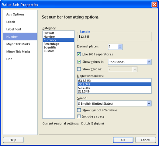
So, now that we're done with the X-axis, let's move on to the next letter of the alphabet. Our Y-axis (also known as Value Axis on a column chart) is not very readable at the moment. The numbers are too large and there's no formatting. You don't even see that this is a currency value.
This time we need the Number page of the Value Axis Properties. We want:
- no decimals
- a thousands separator
- the numbers divided by 1000 (that's the "Show values in" setting)
- a dollar sign in front of the value
And here's our chart again:
Additionally, the axis title has also gotten a clear value. It indicates how the values should be read.
- 4
Y-axis: move to right-hand side
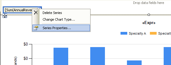
To conclude this article I'll show you how to move the Y-axis to the other side of the chart. This may seem like an odd thing to do, but sometimes the business people want to display a chart that way so you'd better have strong convincing skills or know how to do it. Or both :-)
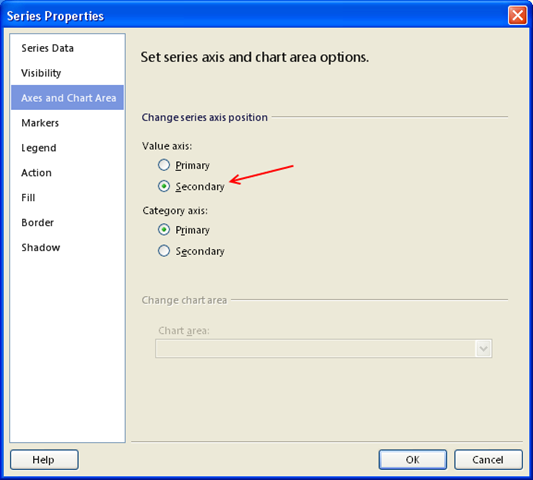
In fact, a chart has got two Value axes and two Category axes, a Primary and a Secondary. The Primary axes are the ones used right now. To move the visible axis to the other side, it's not through the Value Axis Properties as you might think (I think you're getting the hang of it now, right? ;-). No, all you need to do is move all data series to the secondary axis. This can be done through the Series Properties.
The Axis and Chart Area page is the one you're after.
That will give us the following end result:
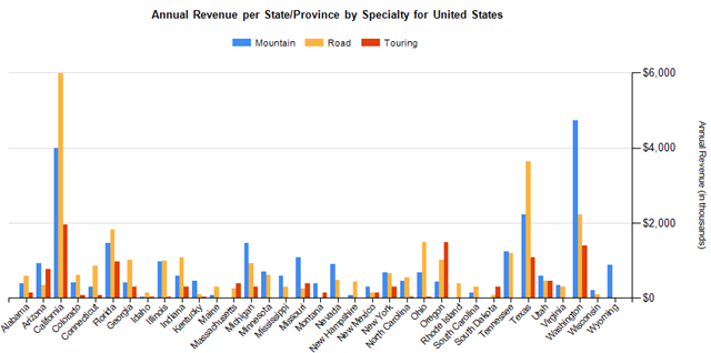
BTW: you will need to re-do the axis formatting when you switch to the secondary axis so better start with axis activation before formatting it.
Ow, if you found this article to be helpful, don't forget to click the "Yes" button below.
Thank you for reading my article, and happy charting
!
No comments:
Post a Comment